
284
284
WCAG standards
WCAG standards
2
2
Core flows re-imagined
2
2
Language regions (FR + EN)
Localization (FR + EN)
Consistency through systems, redesigned user flows.
Consistency through systems, redesigned user flows.

EdTech
X2O Media's OneRoom was a hybrid meeting product combining in-person rooms with remote meetings. The hardware was universally acclaimed, but the software's poor usability was the main driver of churn. Clients reported enjoying the hardware setup but using either Teams or Zoom instead of the native software. The product was locked out of certain markets due having been built without accessibility in mind.
X2O Media's OneRoom was a hybrid meeting product combining in-person rooms with remote meetings. The hardware was universally acclaimed, but the software's poor usability was the main driver of churn. Clients reported enjoying the hardware setup but using either Teams or Zoom instead of the native software. The product was locked out of certain markets due having been built without accessibility in mind.
I led the establishment of an accessibility-first design system to improve usability and reduce user support calls. Working closely with the Product Manager, Product Owner, and FE architect, I redesigned two key user flows using the new component library.
I led the establishment of an accessibility-first design system to improve usability and reduce user support calls. Working closely with the Product Manager, Product Owner, and FE architect, I redesigned two key user flows using the new component library.
Consistency through systems, redesigned user flows.
EdTech
X2O Media's OneRoom was a hybrid meeting product combining in-person rooms with remote meetings. The hardware was universally acclaimed, but the software's poor usability was the main driver of churn. Clients reported enjoying the hardware setup but using either Teams or Zoom instead of the native software. The product was locked out of certain markets due having been built without accessibility in mind.
I led the establishment of an accessibility-first design system to improve usability and reduce user support calls. Working closely with the Product Manager, Product Owner, and FE architect, I redesigned two key user flows using the new component library.
Team
Senior UI /UX /Product Designer (me), PM, PO, FE Architect
Senior UI /UX /Product Designer (me), PM, PO, FE Architect
Platforms
Web / Android / iOS
Web / Android / iOS
Tools
Figma, Storybook, Jira
Figma, Storybook, Jira
Outcomes
2 key user flows improved usability
UI consistency as a result of design system
Accessibility readiness
2 key user flows improved usability
UI consistency as a result of design system
Accessibility readiness
Challenge:
A hybrid learning tool needed to fix usability and add accessibility so they could increase sales and unlock markets.
The biggest challenge was usability. Joining a meeting meant a user had to click through several menus before arriving at a list of meetings. If they chose the wrong meeting, they got stuck. The UI was not accessible and the company couldn't sell to any clients that received government funding, including schools and the military. This meant the product got negative word-of-mouth from current clients, and several prospects couldn't purchase because of the lack of accessibility.
The biggest challenge was usability. Joining a meeting meant a user had to click through several menus before arriving at a list of meetings. If they chose the wrong meeting, they got stuck. The UI was not accessible and the company couldn't sell to any clients that received government funding, including schools and the military. This meant the product got negative word-of-mouth from current clients, and several prospects couldn't purchase because of the lack of accessibility.
The biggest challenge was usability. Joining a meeting meant a user had to click through several menus before arriving at a list of meetings. If they chose the wrong meeting, they got stuck. The UI was not accessible and the company couldn't sell to any clients that received government funding, including schools and the military. This meant the product got negative word-of-mouth from current clients, and several prospects couldn't purchase because of the lack of accessibility.
Goals:
By creating a Design System and Accessibility protocol, we gave the company tools needed for success.
To address these challenges, I aimed to provided recognizable UI that users would understand. This involved mapping the user flows of competitors, and collaborating closely with the Product Owner and Engineering team to be mindful of tech debt when proposing solutions.
Specifically I:
Mapped the join flow of Jitsi, Teams, Meet (Google), and Zoom.
Used Material Design 3 and iOS Design guidelines to create a UI component library.
Worked with the FE architect to ensure components were consistent between Figma and StoryBook.
Worked with the FE architect and Product Owner to audit the product for accessibility and make recommendations for compliance.
Solutions:
By creating systems, getting stakeholder buy-in, and shipping prototype for demos, the UI was simplified and created buzz at tradeshows.
Through stakeholder workshops and in cross-functional meetings, I created a simplified user flow for joining meetings. The prototype was shown at trade shows and got great feedback "It's just like Teams, I don't need any training". In parallel, by working with the FE architect, I created a Design System in Figma and StoryBook component library. Working with Product and Engineering, I created an accessibility protocol to allow us to comply with WCAG 2.1 AA.
As a result, Sales Teams were able to make several deals, including with the UN in South Africa.
Design highlights:
Secondary research, updated join meeting flow
Similar products were tested to find the "common" user flows, so our user experience would be consistent with expectations.
I analyzed the join flows of Microsoft Teams, Google Meet, Jitsi, and Zoom.
There were some differences I had to be mindful of due to our in-person experience, but most of the efficiency users had come to experience in other products could be implemented for us.
I proposed the flow (bottom, in green) and got engineering and product buy-in, often using the PM as the host or participant in the research!

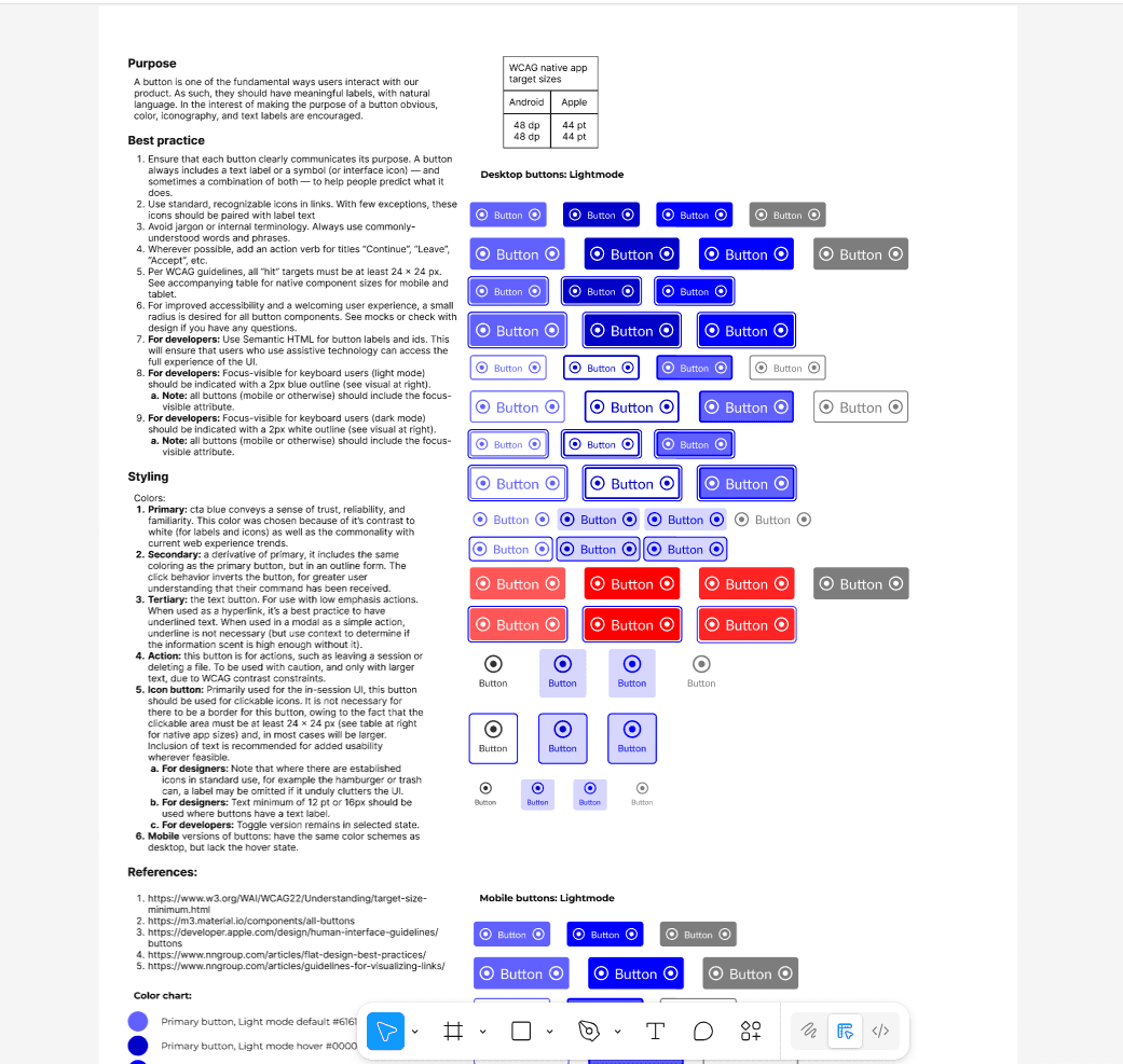
Style guide:
A Design System was created to provide reusable UI components, so product screens would be consistent, accessible, and intuitive.
Primary: cta blue conveys a sense of trust, reliability, and familiarity. This color was chosen because of it’s contrast to white (for labels and icons) as well as the commonality with current web experience trends.
Secondary: a derivative of primary, it includes the same coloring as the primary button, but in an outline form. The click behavior inverts the button, for greater user understanding that their command has been received.
Tertiary: the text button. For use with low emphasis actions. When used as a hyperlink, it’s a best practice to have underlined text. When used in a modal as a simple action, underline is not necessary (but use context to determine if the information scent is high enough without it).
UI updates, more than just aesthetics:
Using the newly created Design System to bring consistency to core user flow screens.
I simplified look and feel for the meeting join process, decreasing cognitive load on the user and adding clarity.
I removed the red background and replaced it with more consistent, accessibilty-first styling; because at first glance users thought there was an error.
The protoype version of the full flow was presented at trade shows and got widespread positive feedback.


Reflections:
This project reinforced the value of Systems thinking before a product had grown, to prevent usability issues.
When the Sales Team refused to give the product team access to clients for user testing, I quickly pivoted to secondary research and leveraging well-established best practices.
I discovered that between the WCAG literature and Nielsen Norman group, much of interaction design has solutions that can be reused.
My continued insistence on metrics led to the company adopting PostHog and setting up some in-product measurements which proved helpful in validating our design decisions.
Justin Penney
Services
Strategic product design
Growth web design